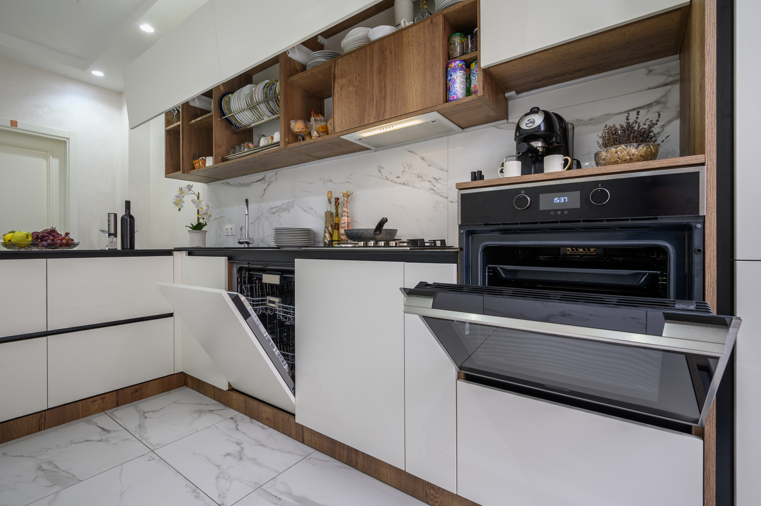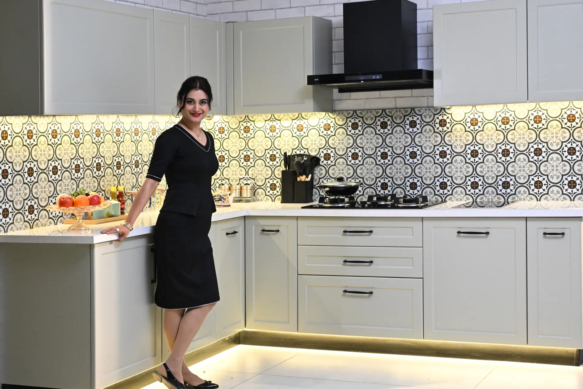
You choose a beige sample in the showroom, take it home and find that it looks almost grey beside the floor. This is why a kitchen colour combination needs to be judged as part of the room. Cabinets occupy a large surface area, and their appearance changes with the neighbouring materials and available light.
Begin with what is already fixed, then narrow the choices. A few well-considered samples will tell you more than scrolling through dozens of unrelated kitchens. The suggestions below are palette ideas for your 2026 project, rather than a ranking of local colour popularity.
Table of Contents
- Kitchen colour choices for your light and flooring
- Choosing a kitchen colour palette with purpose
- Two-tone kitchen colour combinations worth trying
- Kitchen colour combinations and vastu preferences
- How kitchen finishes change cabinet colours
- Approve the kitchen colour combination in context
- Choosing a kitchen colour combination: FAQs
Kitchen colour choices for your light and flooring
Look at the kitchen in daylight and during the hours you usually cook. Notice where the room is bright, which corners remain darker and how the existing floor reads under the lights. Keep a photograph for reference, but make the final decision with physical samples whenever possible.
The countertop and backsplash belong in the same conversation. A strongly patterned stone may work better with calmer shutters, while a plain surface gives you more freedom to introduce colour. Decide which element should attract attention before selecting several competing features.
If the flooring is staying, place your shortlisted shutter samples directly beside it. Do not compare only tiny colour chips held in your hand. A sample viewed vertically at cabinet height gives a better sense of its relationship with the room.
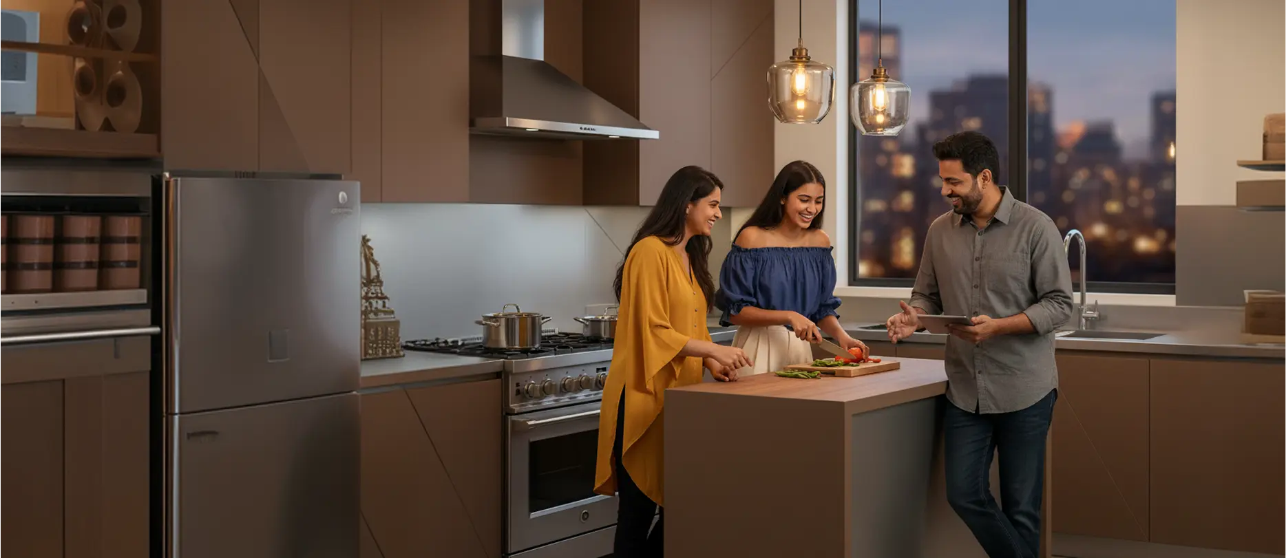
Choosing a kitchen colour palette with purpose
Warm neutrals can provide a quiet background; olive or muted blue can give a cabinet run more presence. Charcoal creates a stronger contrast and needs to be considered with the room’s lighting. None is automatically the best kitchen colour combination for every home.
Testing your shortlist of kitchen colors
Limit the first selection to a few options that work with the fixed materials. Compare them in the intended finish, because a glossy beige and a matte beige may read differently. Our finish guide explains that distinction.
Think about the view from adjoining rooms too. In an open kitchen, the cabinet palette becomes part of the living or dining area. You can connect the spaces through a related tone without matching every piece of furniture exactly.

Two-tone kitchen colour combinations worth trying
Using two shades can help you give different cabinet runs a defined role. A lighter upper run may feel less visually dominant, while the lower cabinets carry a deeper colour. Another option is to keep most shutters neutral and use the second shade on a tall unit.
Lower cabinets | Upper cabinets | Check beside the palette |
|---|---|---|
Olive | Warm off-white | Undertones in the flooring and countertop |
Muted blue | Light beige | Whether the room’s lighting keeps the beige warm |
Charcoal | Soft grey or off-white | Contrast in the darker parts of the room |
Warm brown | Cream | The amount of brown already present elsewhere |
Wood-look finish | A related neutral | Whether the patterns compete with the stone |
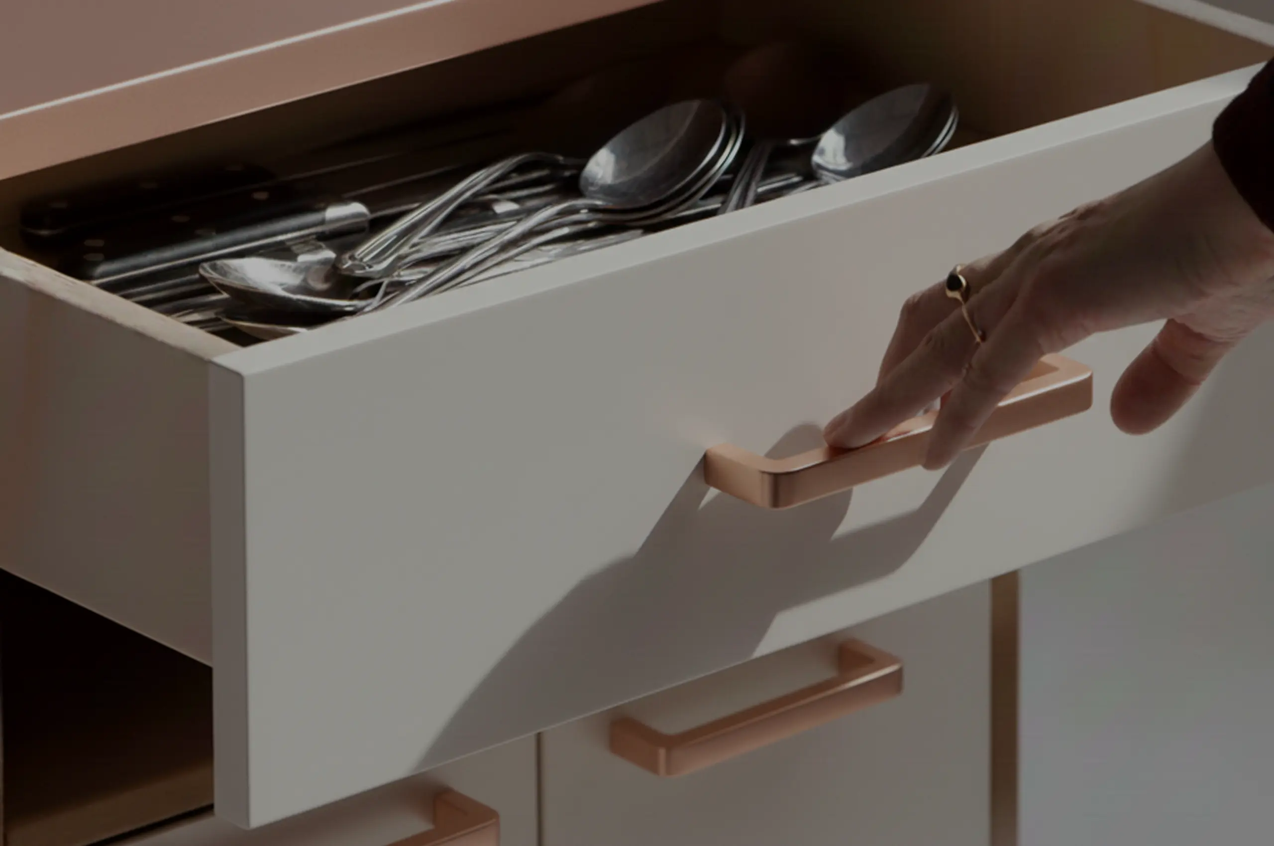
These are starting combinations, not fixed prescriptions. Try the kitchen colour combination with your actual handle finish and backsplash sample. A small metallic detail can change the balance, particularly when several reflective surfaces are already present.
Kitchen colour combinations and vastu preferences
If vastu matters to your family, tell the designer before the palette is finalised. Ask your chosen practitioner which colour preferences apply to your kitchen’s direction and layout, then bring that guidance into the sample discussion. Different interpretations may lead to different recommendations.
Treat these preferences as part of your cultural or personal brief. A colour should not be presented as a guarantee of prosperity, health or improved cooking performance. It still needs to work with visibility, lighting and the materials in the room.
You may be able to accommodate a preferred shade through a smaller cabinet run or a related tone. This can be more comfortable than forcing a strong colour across every shutter. Keep the discussion focused on an arrangement your household is happy to use.
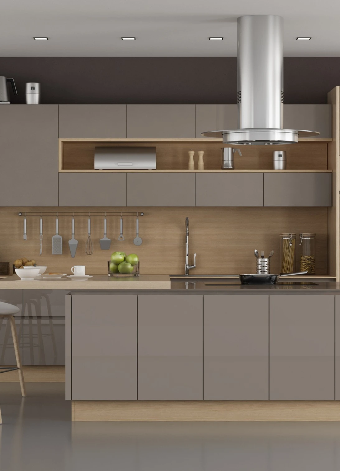
How kitchen finishes change cabinet colours
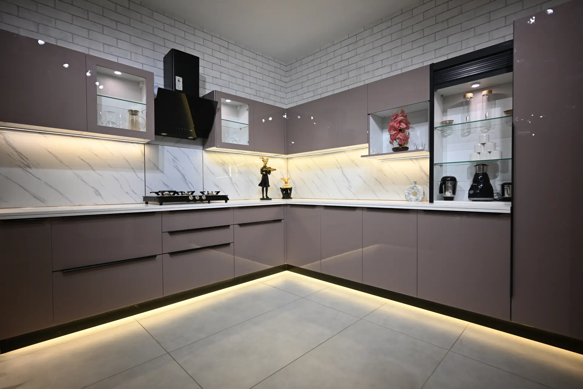
Glossy surfaces reflect their surroundings more strongly than matte ones, while texture adds a different visual character. A metallic finish introduces another response to light. Compare like-sized samples so that the decision is based on the finish you will actually order.
Steelax offers matte, glossy, textured, metallic and wooden finishes. If you are also exploring a new layout, our kitchen design ideas show how colour can work with storage and proportions. Your material specification remains a separate choice beneath the finish.
Our team can place samples together in the showroom and help you reduce the shortlist. Bring a floor tile or countertop reference if you have one. It makes the discussion more useful than choosing from isolated swatches.
Approve the kitchen colour combination in context
Before production, confirm the finish name, colour reference and where each shade will be used. Keep the approved sample information with your order, especially for a two-tone kitchen. A render helps communicate the arrangement, but should not replace the physical finish check.
Give yourself time to look at the shortlist in your home. If one option only works under a particular light or beside a material you are not buying, it may not be the right choice. The preferred palette should feel comfortable under the conditions you will actually live with.
For help choosing your kitchen colour combination, visit Steelax’s experience centre. We can compare the samples with your flooring, finish preferences and room layout before you approve the shutters.
Choosing a kitchen colour combination: FAQs
What should the kitchen colour combination be according to vastu?
If you follow vastu, seek direction-specific guidance from your chosen practitioner before finalising colours. Bring those preferences into the design discussion while checking light, visibility and the room’s existing materials.
Which colours work well in a small kitchen?
Start with the available light and surrounding surfaces. Lighter cabinets are one option, but contrast and finish also affect the appearance. Test samples in the room rather than choosing solely by its size.
Can steel kitchen shutters have a wood-look finish?
Yes. Steelax offers wooden finishes alongside matte, glossy, metallic and textured options. The visual finish and the underlying steel specification are separate decisions.
Should the upper and lower cabinets match?
They can match, or you can use two related shades. Decide which run should attract attention and compare the complete palette with the countertop, flooring and hardware before approving it.